
Portfolio Highlights
EMC
EMC is a leading provider of IT storage and cloud computing solutions, including an award-winning data center management application for which I was UX team lead.
Apple
Apple's iAd platform raised the bar for advertising on mobile devices and is now doing the same for Internet radio. Take a look at how my usability research and design work helped to shape it.

Nuance Communications
Nuance's industry-leading Dragon speech platform and clinical documentation solutions are transforming health care IT. Learn how my research and design work contribute to this success.

American Express
AMEX values software usability for both their cardmembers and campaign management staff. Here are my design solutions that improved the UX for these two unique audiences.
PNC Financial Services
After PNC acquired ADVISORport, I led a UX consulting team that helped turn it into an award-winning Unified Managed Account platform. My methodologies and designs are showcased here.

Procter & Gamble
P&G was looking to learn more about offline consumer behavior by improving user engagement with their online community site, Vocalpoint. Check out my research and redesigns for this project.
Featured Posts
Accommodating Color Blind Users
Assistive technologies and designing for accessibility have become a common practice in user interface design for most desktop and web-based applications. Guidelines have been in place for over a decade that inform usability professionals how to prepare Web content for users with physical or cognitive disabilities. One of the more common physical disabilities is color blindness. Color is an important design element, but it should never be used as the sole method of communicating information.
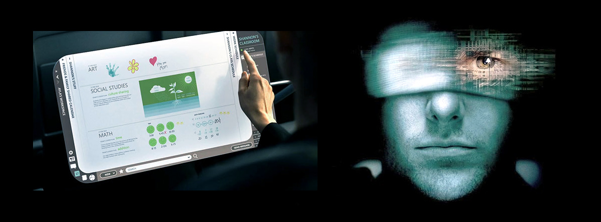
Touching the Future
In the 2002 sci-fi thriller Minority Report, one of the more memorable and talked about scenes was of Tom Cruise standing in front of a large transparent “video wall” engaged in a dizzying series of hand gestures. This technology is an example of “ubiquitous computing”, and you’ve probably already used the precursors to these futuristic applications in the forms of RSS new feeds, recommender engines, motion sensors, and mobile devices.